Navigation
Subscribe
Tuesday
Jul242012

'How Many People Use Twitter's Own Apps?'

The only people who would care would be the geeks, like me and anyone else who could be bothered to read this post, who actually care about the client they are using. And let’s face it, Twitter doesn’t care about geeks.

Benjamin Mayo ran a script that scanned through a million tweets and then reported back the particular Twitter client each tweet originated from, in order to see which ones were the most popular amongst users. When the data was put together, he found a few interesting results. Go check it out.

Benjamin Mayo | How Many People Use Twitter's Own Apps?

via Gruber

Friday
Jul132012

Apple is Back on EPEAT

After receiving a lot of complaints that they had pulled their products from the EPEAT environmental registry, Apple has issued a public statement apologizing for doing so, while also announcing that they are back on the registry again.

"It’s important to know that our commitment to protecting the environment has never changed, and today it is as strong as ever. Apple makes the most environmentally responsible products in our industry. In fact, our engineering teams have worked incredibly hard over the years to make our products even more environmentally friendly, and much of our progress has come in areas not yet measured by EPEAT."

Overall, this seems like a good thing. Apple's image of being an environmentally-friendly company is part of what sets them apart from the competition, and taking themselves off the EPEAT registry is a fast way to tarnish that image in customers' eyes, regardless of the reasoning behind it. If this means that Apple's environmental standards become even higher than before, then I'm all for it.

Apple | A Letter from Bob Mansfield

Friday
Jul132012

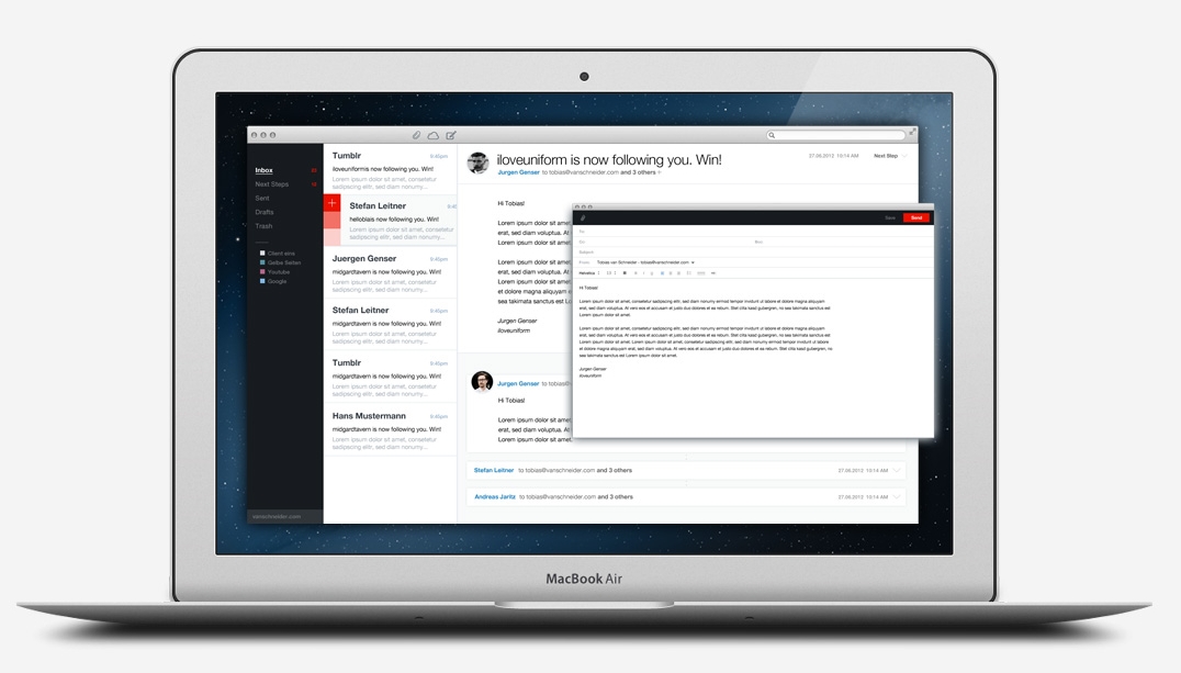
.Mail Concept

Graphic designer Tobias van Schneider has been working on an idea for a new email client that he calls .Mail. This isn't something that's in production, but there's definitely a solid foundation here already, at least in terms of user experience.

"We're able to produce absolutely stunning websites and mobile apps with great interaction design. Interfaces that are smooth and fun and let us understand information without even trying. But when it comes to email clients we get a bit of a boring feeling, like using an old piece of software from 10 years ago.

I think we can do better. So let's do that."

I'm not the type of person that deals with email a whole lot, so perhaps this solution would be a bit overkill for me (I'm doing okay with the basic Gmail web client), but there's no denying that this would be a beautiful app and I'd probably end up using it anyway.

Head over to his site and read through all of the concepts behind the project.

Tobias van Schneider | .Mail

Tuesday
Jul102012

Dropbox Adds New 500GB Tier, Doubles Size of Older Subscriptions

Today, the Dropbox team announced something big:

"Today we’re happy to announce that our upgrades are getting a huge upgrade! Dropbox Pro now comes in flavors of 100 and 200 GB, but at the price of the original 50 and 100 GB plans. For those of you who need even more space, a brand new 500 GB plan is also joining the posse! If you’re already a Dropbox Pro subscriber, just take a seat and enjoy the fireworks — your Dropbox will supersize itself automatically tonight."

I've been thinking about upgrading from 50GB to 100GB anyway, so this is huge for me.

Dropbox Blog | New Dropbox Pro Plans!

Thursday
Jul052012

CopyPasteCharacter

I'm sure that for some people this is definitely old news, but I still think it's worth sharing. If you're doing a lot of writing on a computer, you're sure to come across a time when you'll need to add a special unicode symbol to your text. This is where CopyPasteCharacter comes in.

This site has just about every kind of unusual character you could think of. There are literally hundreds of them! The site is super simple to use, too. Just click on a character and it's copied to your clipboard automatically, so that you can easily paste it elsewhere.

Having such a huge number of characters seems overwhelming at first, especially if you're just looking for one specific thing, but thankfully you have the option of creating your own sets of characters that you can edit as you please, in case there are certain characters you use a lot. Unfortunately, their accompanying iPhone app does not (yet) support personal sets, and I hope in the future that they will allow you to sign into your account from your phone and sync character sets back and forth.

Despte that little flaw, I use this site all the time and it has become indispensable in my workflow, so I highly recommend it. Keep it bookmarked.

CopyPasteCharacter

Tuesday
Jul032012

'Stop Not Linking'

Matthew Panzarino:

"So that’s what I do. I offer a link early in the post, clearly defined and visible. I also attempt to pull out what information is necessary to build thoughts and context off of and, when appropriate, indicate that readers should visit the source to read more information."

This is essentially how I attempt to link to posts on Unretrofied. I'm always tinkering with my process and the site's design in general, but my hope is that I'm successfully sending traffic to the people who I'm quoting. That's why I like to have links presented early on in each post, as well as a follow-up link at the bottom of the post just for good measure.

I've thought about removing that additional follow-up link because maybe it's a bit over the top and most people are smart enough to figure things out from the first link alone, but overall I don't think it's hurting anything.

I also designate these link-posts by using the same title used in the original article I'm linking to, but contained within apostrophes*. I don't know if other bloggers would see this as kosher or if it's standard practice, but I think it gives a good first impression of what type of post will follow.

He makes some other good points in his post, so go read it.

Matthew Panzarino | Stop Not Linking

*I use apostrophes instead of quotes because it's not like it's an exact quote from their piece. I'm definitely not an English major and have no idea what the proper way of doing this would be, but it "feels" right to me.

Tuesday
Jul032012

'The Problem with Logos'

Speaking of Minimally Minimal, I'm going back through some of its older posts because I find most of them to be very fascinating, as someone with an interest in branding and design. And minimalism, really.

This one speaks to me quite a bit because I feel the exact same way about logos being splattered all over products today. I don't buy things like clothes or smartphones just because they carry a certain brand name or logo in an obvious way. If anything, I find it to be a huge turnoff.

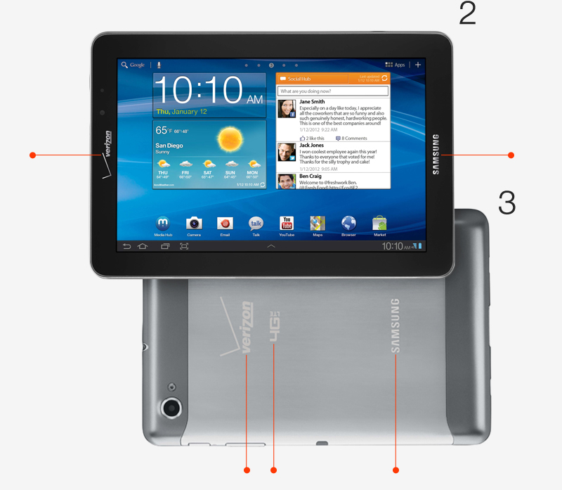
Regarding the Samsung Galaxy Tab (pictured above), Andrew had this to say:

"Here is another example. Can you believe this? This is criminal. The Galaxy tab has 2 logos on the front and 3 GIANT logos on the back. People should go out and riot about this device. What is this, an F1 car? Verizon and Samsung should have to pay people to use this."

Couldn't have said it any better myself. If you've already paid for the device but are then forced to be a walking advertisement for the company, they should be sending you a check in the mail. Ridiculous.

Go read the rest of his post, it's all spot-on. Make sure to read the follow-up post, too.

Minimally Minimal | Coffee Time: The Problem with Logos

Tuesday
Jul032012

'The Next Microsoft'

Andrew Kim, of Minimally Minimal, has been experimenting with a complete rebranding concept for Microsoft. These are the results, and they're beautiful. Inspiring, even.

Not only that, but each facet of the experiment makes complete sense, one example being a redesign of the Windows logo in order to match the reality of windows in the metro (get it?), instead of the old-school home window concept. I hope every Microsoft exec looks at this and agrees with the ideas, because they could definitely use a new image.

Minimally Minimal | The Next Microsoft

Tuesday
Jun262012

WTHR

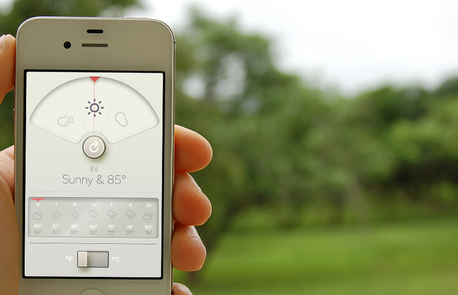
Thanks to Ben Brooks, I just found out about this beautiful weather app for iOS, WTHR. Thirty seconds and one dollar later (god, I love technology), I had purchased the app and I have to say, it works exactly as advertised: simple and elegant. The few animations within the app are all very smooth.

Currently the only issue I see is that there's a bug that causes iOS Location Services to be enabled all the time, even if you kill the app from the switcher tray. Fortunately, developer David Elgena is aware of this and will be releasing the fix shortly. Don't let that deter you though, this is a great example of app design and I still recommend it. Dieter Rams would be proud.

WTHR [iTunes]

Tuesday
Jun262012

Apple Releases 'Podcasts' App for iOS

Looks like the rumors were correct. I'm sure a lot of people will claim this as the downfall of 3rd-party podcasting apps, but I'm not convinced of that. Apple's feature list for this app is...okay, but nothing spectacular. I'll probably still be sticking with Instacast for the forseeable future. If you want to check it out anyway, here you go:

Podcasts [iTunes link]

Page 1 2 3 4 5 ... 9